
Over 900,000 parents and kids—the leading debit card and financial education product for families.
Increased sticker
usage by x5-6
Problem 🤔
When teens (13+) request or send money, only about 5% of them include a sticker. On the left screen, it was ~15-20% before it was changed to the right screen (small blue icon).


Before app UI changes, teens were using the “Add a gif” button ~15-20% before the change
App UI changed
Hypothesis 🧠
If we make the sticker button more prominent, then it would increase the usage of stickers
If we show a few stickers on the amount screen, then it would increase the usage of stickers

Solution
We ran an experiment with 3 variants to test the hypothesis, over a four-week period.
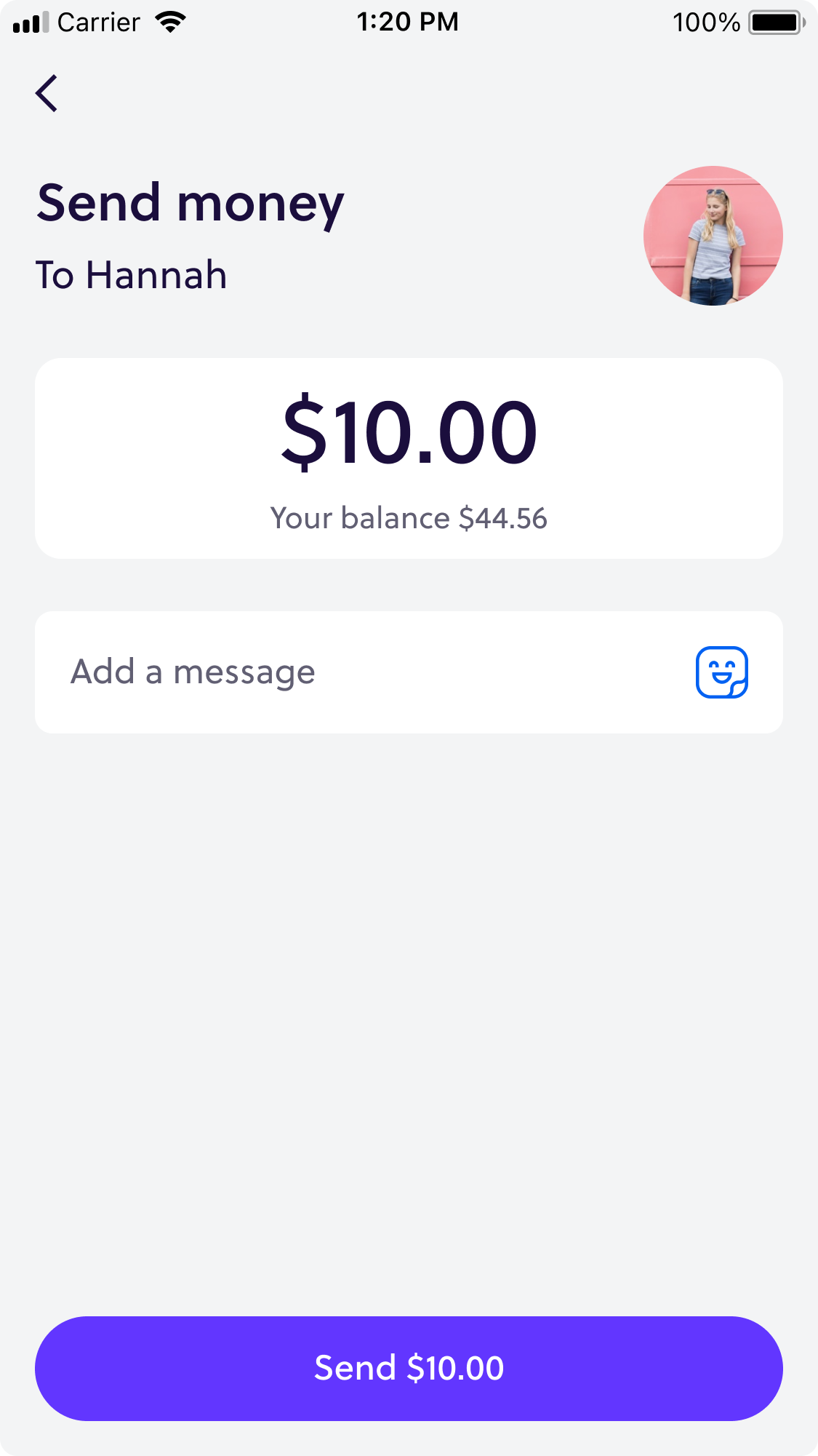
Control
Traffic:33%
Existing design (with a small sticker icon inside the text field).

TEST 1
Traffic:33%
Bigger button, sitting below the message field.

TEST 2
Traffic:33%
Sticker suggestions, display a different set of stickers depending on whether the teen is sending or requesting money.
Success metrics
2
% of Peer-to-Peer send or request with any social content (either a sticker or message).
1
% of Peer-to-Peer send or request with a sticker.
Result 🙌
Increased sticker usage by x5-6 in the UK and USA, and a direct impact in weekly retention of Peer-to-Peer features in the UK.
Success metric 1
% of Peer-to-Peer send or request with a sticker:
Control
3.6%
4.3%
Test 1
12.5%
15.3%
Test 2 🏆
22.7%
22.6%
Success metric 2
% of Peer-to-Peer send or request with any social content (either a sticker or message):
Control
19.3%
21.5%
Test 1
25.7%
31.9%
Test 2 🏆
35.4%
37.2%
CVR % 🇬🇧
CVR % 🇺🇸
CVR % 🇬🇧
CVR % 🇺🇸

